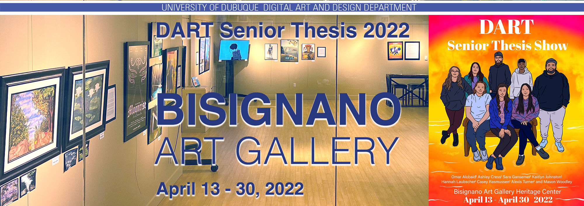
DART Senior Thesis Show
April 13 - 30, 2022
Essay - DART Senior Thesis Show
The Digital Art and Design (DART) Department teaches creativity. Oh you might not see it that way, but once we get beyond which button click does what, the students' creativity enters in. And that's when real growth occurs. You can see it in their works, surely. You also see it in their faces and hear it in their voices. There is a transformation that occurs. We call it the Senior Thesis show.
Most of the students in the DART program focus on what we call application software. The students populate their portfolios with logos and stationery designs, with tightly video-edited advertisements, with websites driving traffic to a brick and mortar store, with 2D and 3D animations. After all, these are the applications that employers will be looking for when they hire our students.
And I must admit, our students excel. Thanks to their persistence and the 'care and watering' by our faculty, these seniors are ready to face the world (like graduates before them) and start their digital design careers.
What we see in this show is how students can focus on one project and explore it, both visually (obviously) but also in written form. The Senior Thesis statements are carefully crafted reflections of their thesis hopes and goals. It is with great pride that we present them here.
If it seems that there is little unity amongst the works, then both the students and we faculty have done our jobs. Art, after all, is a lonely and individual enterprise. For a semester, these students have been working out videos or designs or books or posters or websites to explore certain topics. That's what makes this show, the last of the academic semester, so exciting. (And we hope you agree.)
Alan Garfield
Director, Bisignano Art Gallery
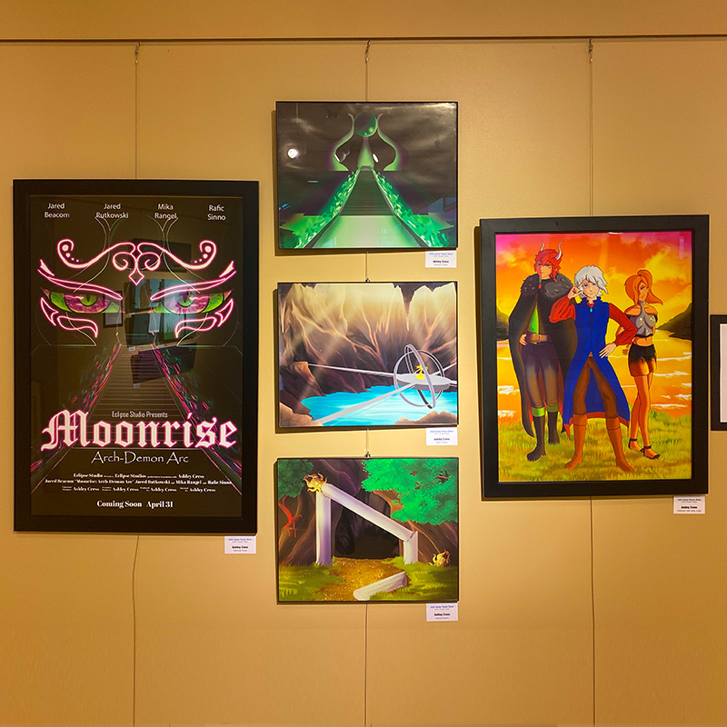
I have always loved fantasy and adventure stories, whether they be books, shows, or video games. I have found them more appealing to me then stories set in a modern age. Stories with magic, knights, and dragons are the best kinds of stories, at least for me. One of my favorite fantasy adventure stories is The Legend of Zelda game franchise. Each game had an amazing story to tell and had an amazing cast of characters. It was this franchise that inspired me to create Moonrise. Believe it or not this story started out as a Legend of Zelda fanfiction that I started writing my freshman year of high school. After a while of writing the story I found myself creating original characters and building a large-scale world that wasn’t based in the game. It was at this moment I decided to rewrite this story to be an original animation.
However, at that point in my life I had no clue how to animate. So instead of focusing on what I couldn’t do I focused on what I could. Each character went through many stages of character designing, I built the world up from scratch, made maps, and I wrote lore into the world along with Gods and Goddess. I spent the rest of my high school years working on the ground work of the world in order to prepare myself for animating it once I got to college. The last thing I needed was a name for it, I decided to call it Moonrise after the main antagonist of the story, and because he was one of my favorite characters to draw.
Moonrise is an animated series that follows a brilliant cast of characters including a prince, a knight, a thief, a few wizards, and a half demon as they strive to take down the evil brewing in their world. While I would have loved to animate the beginning of the series for this project I wanted the viewers to get to see some of my favorite characters that don’t appear until later in the series. In this sneak peek we follow Prince Alfalir (Al-fa-leer) Silverwing, Adar Falstar, and Xara Moonfall as they try to find a way to summon the Sun God Sazin to ask for his aid in fighting Lord Moonfall. Little do they know they are walking a path filled with danger and darkness, for there is a fourth among them seeking revenge.
Learning to 2D animate was an interesting experience, I did a smaller animation last semester using photoshop and while it was impressive for my first attempt there was room for improvement. So, I decided to do another animation for my senior thesis, and I will say I’m happy with how it came out. I decided to use photoshop to animate this because it allowed me to animate in my drawing style. While it is tedious it was well worth the effort. Along with the animation I designed a poster to go along with the animation. In the poster you can see the outline of Arrukuths shrine in the background, in the foreground you see Arrukuths eyes and tattoos, showing off his oddly colored eyes. Along with the poster I illustrated three backgrounds, when I have more time to make more of this series these are how detailed the backgrounds will be. Finally, we have the three main characters fully drawn and colored so everyone can see their full character designs.
I have many people that I owe a lot to so I would first like to thank, Jared Beacom, Jared Rutkowski, Mika Rangel, and Rafic Sinno for doing the voice acting and bringing my characters to life. I wouldn’t have been able to do this project without you. Next, I would like to thank my Mom Holly Sinno for always being there to encourage me when I got frustrated while working on this project. I would also like to thank my sister Allison Cress for being the biggest inspiration to me and for always telling me to keep getting better, I wish you could’ve been here to see me accomplish something this amazing. Finally, I would like to give the biggest shout out to the professors Sheila Sabers, and Jean Holdener for helping me create the best possible animation I could create for my final project here at University of Dubuque.
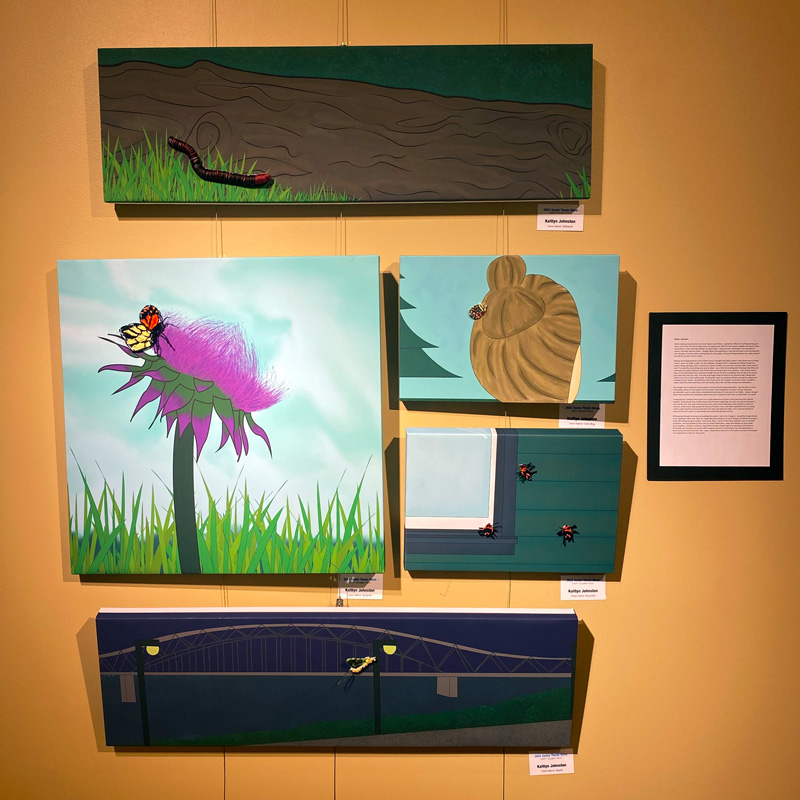
While creating my pieces for my senior thesis, Iowa Native, I wanted to reflect on my life growing up in Iowa. Each of the five pieces helps show my experiences with the cool creepy crawlies and where I have found them in their roaming habitats. As I grew older, I became more interested in the wonders of nature, and what may live there. I thought about the experiences I had and still have in the summertime with all types of insects while creating ideas for this project. The joy of being outdoors has really inspired me and the art that I like to create.
Making the backgrounds for each of these works I thought hard about where I have found each of these insects, which all reside in Iowa. For the millipede I thought back to camping and hiking through the woods, lifting old logs to find a surprise of a bunch of rolled up worm like creatures with a hard smooth shell. The butterfly scene brings me back to when I was a little kid catching and releasing butterflies and watching them land on flowers. One of the most annoying insects in my opinion, is the mayfly, found down by the Mississippi River, and even though they do not bite or anything, they do like to fly around your head and drive you crazy. The next bug scene is of the stink bug, which you can usually find stuck in your hair as you walk around on a hot summer day. Lastly are the boxelder bugs and finding them covering the sidings and windows of your house, I can distinctly smell them just by the thought. For all the scenes I wanted to make it have an artistic and flowy look with earthy colors that will help contrast my embroidery.
My thought was to make the insects pop out of the pictures using embroidery. I got the idea to create embroidery pieces for this project from the towel I have hanging on my stove at home. My great grandmother used to make these embroidered hand towels for everyone in our family, and luckily, I was able to run off with one before she had passed. I always thought about how beautiful her embroidery pieces were and I wanted to learn how to create them for myself.
A large goal for creating these pieces is to create awareness of insects and preserving their natural habitats. Some people may not like insects and find them disgusting, but what may not be realized is they are the ones who help create beauty in the world. Some bugs help create the dirt in which we stand on, while others help spread the beauty of flowers, trees, and other vegetation. We as a group need to work towards protecting the land and rivers and saving the bugs. Even if you do not like an insect, do not kill it when it is just trying to live its life just like you and me.
While going through the process of creating this project I had a lot of support. I would like to give thanks to my significant other Joey Peter for supporting and pushing me to work through and finish this project, while still helping me get to where I need to be. Next, I want to thank Jean Holdener, one of my DART professors, who has helped me fine tune my mixed media ideas, along with helping me piece these works together. Another professor I would like to thank is Sheila Sabers for teaching me the skills in Photoshop and Illustrator during the DART program and also for believing in me and supporting my ideas during the Senior Seminar class. Lastly I would like to thank all of my friends who have encouraged and supported my ideas for this project.
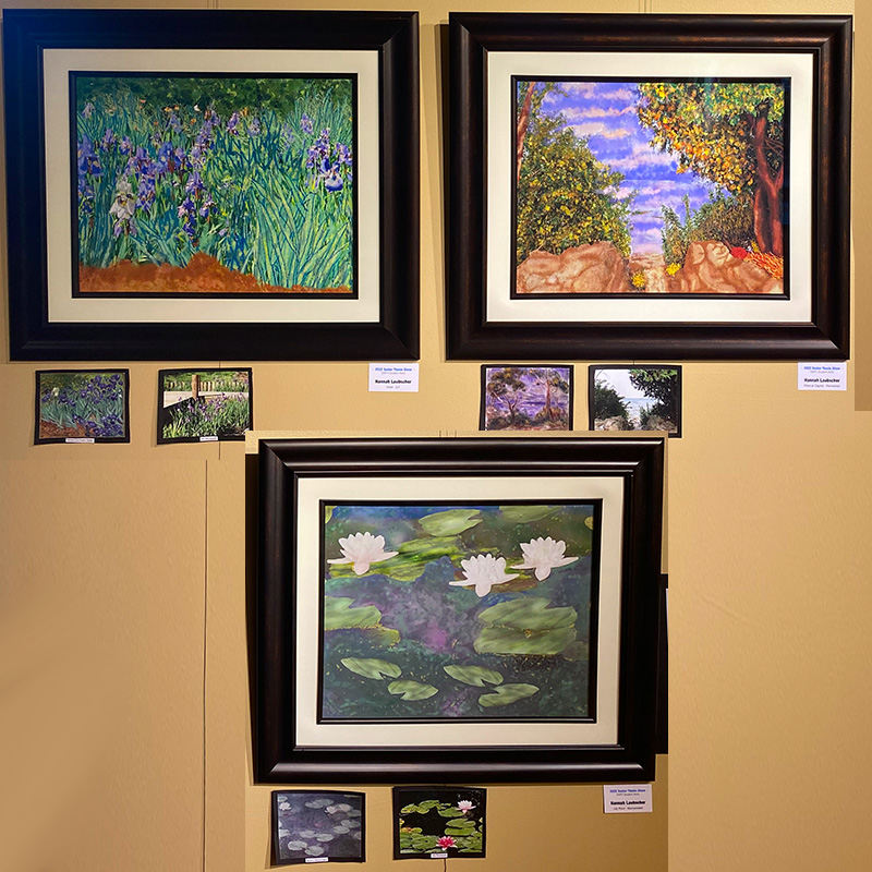
The process of coming up with an idea for my senior thesis was not an easy one. I started by thinking back over the last four years and all the amazing things that I have learned. One thing that really stood out was taking History of Western Art from Professor Garfield. While I have always loved art, no one had ever made the great masterpieces come alive , the way that Professor Garfield did. I always looked forward to that class. I realized that I often find myself drawing my artistic inspiration from the masters. That is why the title of my project is “Inspired By the Masters”. Last summer I visited the Botanical Gardens in Des Moines and they had the most beautiful lily pond and while taking photographs, I found myself thinking about all the lily pond paintings that Monet had done. This is why I decided to do my own interpretation of famous artists’ paintings. I used my own modern, yet similar setting in photography and digitally painted them in watercolor using Adobe Photoshop. I enhanced them to resemble the original masterpieces while also bringing my own modern interpretation. This is the first time that I have done digital painting, so I was excited to experiment and perfect my technique.
My first painting is titled “Pines at Cagnes- Reinvented”. This is based on Renoir’s “Les Pins a Cagnes” 1919. Renoir, a French Impressionist, was known for painting quickly, frequently completing a painting every two days. For my painting, I used a photograph that I took in Door County Wisconsin, looking through the trees into Lake Michigan. The sea and the skyline seemed to blend together. I have painted it using the same cool tone color scheme that is highlighted with yellow in the trees. The sea and the skyline blended together. The movement in my painting gives the impression that it was painted quickly.
My second painting is titled “Irises- 2.0” and is based on Vincent Van Gogh’s painting “Irises” from 1889, shortly after he was admitted to an asylum. While at the asylum he painted over 130 paintings. In 1987, his original Irises painting sold for $53.9 million and is at The Getty Art Museum. My painting uses my photograph taken of the Japanese irises in the Japanese Garden in Dubuque. The colors used in the irises painting are an eye catching deep, purple iris, contrasted by the golden yellow flowers in the background. I have tried to mimick those colors in my painting, as well as the single iris which seems to stand alone and is white. There is a variety to the shapes of each iris shown by the twisted and curved lines.
My third painting is titled “Lily Pond- Reincarnated”. Claude Monet painted many lily ponds between 1897-1899. The one I have chosen to use has three white flowers on the lily pads. I am using my photograph of the lily ponds at the Botanical Gardens in Des Moines. I have duplicated the various shades of green and blue.
I never would have been able to get through the last four years without the tremendous support of my parents, Ken and Ann. They were always there for me, encouraging me and helping me to stay motivated no matter what happened. I am also so very grateful to the professors in the DART program who were so willing to give of their time, to give me extra help and guide me through it. It is because of you, that I was able to find the true joy of art and my voice. Thank you to all the wonderful friends I have made, especially my DART friends that were always there when I needed them. I am so grateful to have been able to attend the University of Dubuque, and my experience has been enriched through the special friendships I have made at Chapel. I can’t believe that this journey is coming to an end.
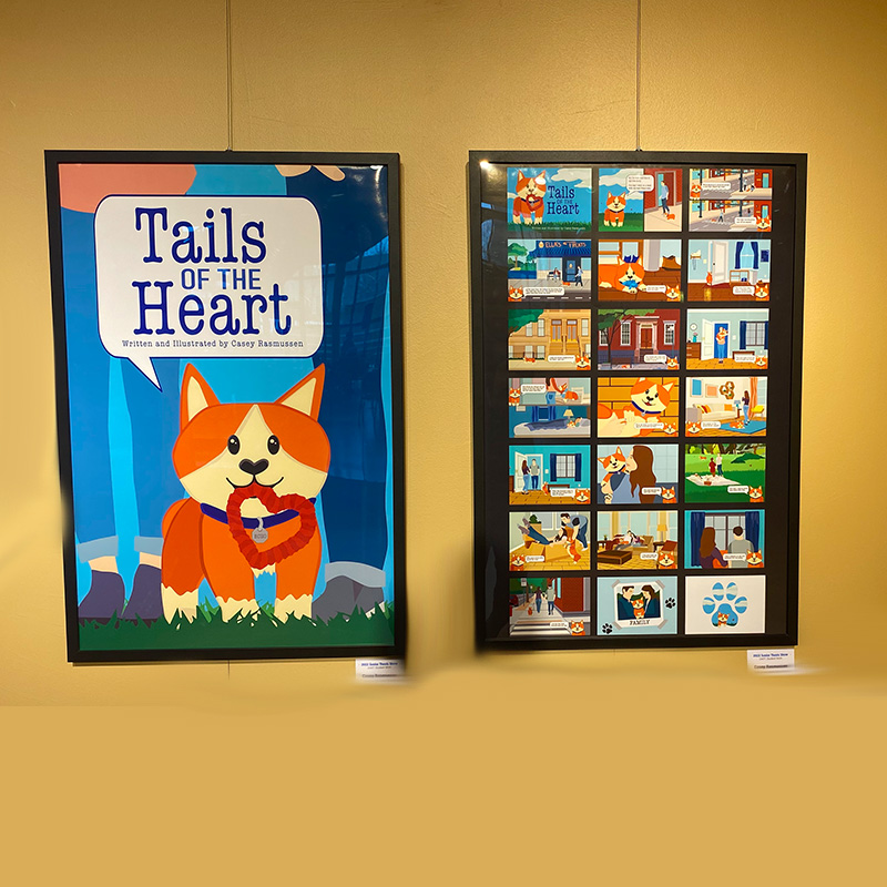
For my senior project I created a 20-page illustrated story with front and back covers. Along with an original poster design and a video version of the book. I titled my book “Tales of the Heart.” The story is told from the dog's point of view. The story consists of a dog that leaves its house to explore and ends up getting lost. A nice woman finds the dog and becomes the dog's new friend and ultimately the woman falls in love with the dog's owner. Some of the story is told with the text but some of it is also shown through the illustration. This project gave me an opportunity to create long term work with a lot of detail. It is great that I have the chance to show off the work I spent so much time and effort on.
When thinking about this project I have always liked being a storyteller. Whether it's talking about my day or coming up with some made up persona with my friends. Creating stories has always brought me joy. This project gave me the chance to write the story and show others what I envisioned it would look like in my head. I always thought it was interesting that ten people could read the same book and imagine the characters in such different ways. I tried to invent a simple story line that included the things I love. That being fictional romance and dogs of course. I imagined the story being told from how the dog would have seen it. With the writing being simple enough for a young reader, but the images creating another story line on top of it from the human characters perspective. Kind of like reading between the lines.
I learned that creating images in Adobe Illustrator is something I really enjoy. Designing the backgrounds and building up 2D spaces is challenging and fun. Over the course of the semester, I collected reference photos and began building up the different scenes. I wanted to keep the colors at least semi realistic, but my main focus was making sure the dog in each scene was easily noticeable. Many of the pages use blue to get the complimentary color contrast from the orange dog. I wanted the pages to feel realistic but still be playful and bright. In the end everything came out beautifully with the exception of some printing issues. Unfortunately, the pages were cut much shorter then I originally expected by the company. I still think the book came out great anyway. I also enjoyed bringing my book into the virtual world with simple video editing. For this project I used transitions that gave the effect of pages turning. I wanted it to feel like a live reading of the book. I liked the idea of having a physical and virtual version of my work as well as the poster aspect. I designed the poster after finishing the book. I used some aspects from the pages to create a new design for the poster. Overall, I am very proud of the finished product I created.
I would like to give gratitude to everyone who has helped me reach this point. I would like to thank my parents Jane and Chad for supporting me through school and always encouraging me to do my best. My friends Emily, Mika and Harlie for always being there for me when I need it and for listening to me drone on and on about design theory. I know they are probably tired of me talking about fonts and colors. I would like to thank my DART teachers for increasing my love for design and giving me the skills needed to be my best. I would also like to thank my fellow classmate Ashely for encouraging me at odd hours of the night when I found myself struggling with homework and my other classmate Jared for making class entertaining and dealing with my sarcasm. I’m very proud of how far I have come and I am extremely thankful for everyone who has helped me along the way.
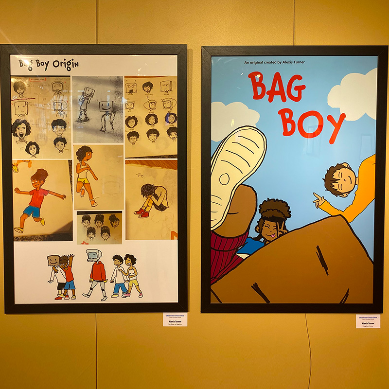
I have always been obsessed with cartoons and anime. It is all I would ever watch. Shows like Spongebob, Pokemon and Teen Titans would encaptivate me, and not just because of the entertainment it would provide but also because the different styles each animation had. It was so interesting seeing how each show had their own recognizable style. This is what encouraged me to find my own style and create a title sequence for my show.
Digg was originally created for a t-shirt design. I created him when I was sitting in Professor Jean Holdener’s class for Professor Sheila Sabers’ class. When I first made him, it was mainly to represent myself which is another reason why I wanted to animate the title sequence. I have never animated to this extent before, let alone put so many details into the backgrounds of my drawings. It was exciting and stressful process. I had to continually remind myself that this was my first time and usually a whole team of animators do this. It definitely did not turn out how imagined but I am still proud of the results. I was finally able to animate my original characters and learn how to animate on Photoshop in the process. I definitely want to remake this in the future to get close to my original vision as possible.
For me, the bag represents my anxiety, my shyness and just how I always tend to mask my feelings. For others it would represent masking their feelings, social anxiety, and many other things. I thought it was interesting seeing how other people would interpret my character and made it personal for them. How immediately when they would see Digg, they knew he was my character. It always made me smile.
I personally do not think I have had a hard life, but I have experienced a lot and have been through traumatic events. From witnessing my grandfather’s death to me tearing my ACL during soccer season to me getting wrongly accused of stealing and being questioned by the police, I have been through a lot. Those events may have affected me and been difficult during the time they happened, but I never felt like my life was hard because of them. I have always been an optimist wanting to be the strong one in any situation. Always be the one to make others laugh even when I am hurting. There’s positives and negatives to this. I am someone others can always lean on, but I also never really lean on others, not even with my closest friends or family. I always tend to keep it to myself and let it build up. Digg’s story and represents how I want to become, be able to take off my bag and lean on others.
Firstly, I would like to thank my parents, Ron and Lesley, and my grandparents, Roger and Linda for their endless support. They were hesitant at first when I mentioned I wanted to be an animator but once they saw how passionate I was about it they made sure to do everything they could to help me pursue my dream. Secondly, I’d like to thank my friends: Emily (Noodle), Elena, Jerrica, and Sean. They have also been some of my biggest supporters. From them coming to my soccer games to them giving honest input of my art when I would ask for it, I truly appreciate them. Thirdly, I’d like to thank the coaches and teachers I have had throughout my life. All the lessons I have learned, I still use today, except math. I still appreciate my math teacher, Mr. Mohler for teaching me life lessons. Lastly, I’d like to thank God. I am where I am today because of him. I know I do not show it but I genuinely love and appreciate all of you.
The amount of support I have had during the creation of Digg has been amazing. Seeing how others could make my character personally relate to them would always reminds me why I wanted to be an animator in the first place. To make relatable creations that would make people either smile, laugh or just have some sort of connection to it.
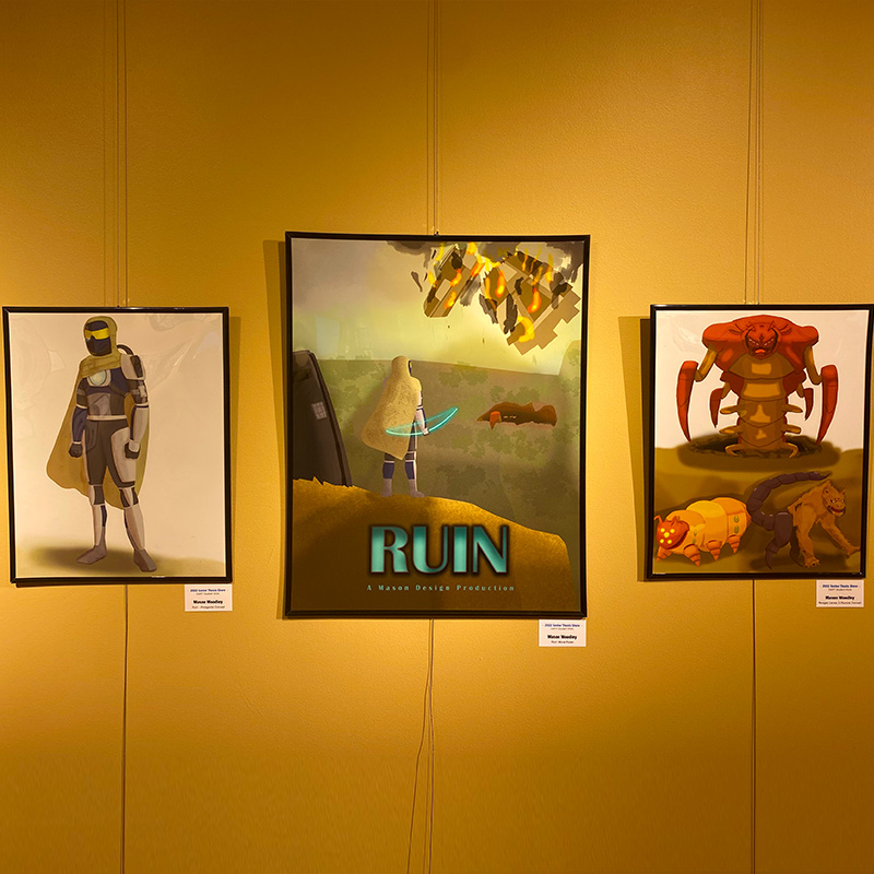
My project revolves around the idea of “Ruin”, a 2D side-scrolling game that I have been developing. The objective of the game is survival, with the main character working their way to the end of the level by fighting enemies and bosses by utilizing a variety of different movements and attacks at their disposal. I chose to present my project in a way that anticipates a full release of the game in the future, with the core elements of the project being a gameplay trailer, movie-styled poster, and concept art for some of the characters present in the game.
I developed my project by first designing the concepts of the characters, using post-apocalyptic and sci-fi themes based upon other games and forms of media that I enjoy. The enemies are primarily based upon elements of existing animals combined with other elements to appear mutated and far more hostile, whereas the main character is based upon sci-fi elements to contrast with both the enemies and environments they will be encountering. I chose to base the game around these themes to create a sense of contrast between the protagonist and their environment, making the player feel like they are isolated in a hostile environment, creating feelings of unrest and anticipation, always unsure about hen and what is going to happen next.
I chose to make my project a 2D game because of my enjoyment of gaming as a hobby, and to learn 2D Gaming as I was unable to take this course during my time at UD. I primarily used the GameSalad program to develop the game itself and to gather the footage needed to create the trailer. I also used Adobe Photoshop to develop the game’s assets, concept art, and poster. I chose to present my project through a poster and gameplay trailer in order to match up with how most game developers advertise their games, and wanting to recreate the same sense of excitement and enjoyment that I get from seeing advertisements for a new game. I chose to include the large format concept art as part of my presentation in order to show the characters in my usual art style in the fully-detailed and drawn version.
Finally, I would like to give my thanks to the people that have helped me along the way through the development of this project. I would first like to thank my parents, Leland and Valerie, for being a constant source of encouragement and support, giving me advice and letting me bounce ideas off them, as well as helping me to further develop my passion for art and gaming and turn it into a career path. I would also like to thank all of my family and friends for giving me opportunities to not only brainstorm ideas with them, but also for providing me chances to take breaks and recharge myself by hanging out and enjoying other activities, or even just sitting and talking. I also need to thank my professors, Jim and Sheila, for helping to steer me in the right direction when working on my project, Jean for helping me to develop my character design and digital art skills, and Alan for being a continual source of entertainment and feedback when I needed a second opinion. Without all of them, I would not have been able to turn what I thought would be just a hobby into a full career path that I would enjoy every step of the way.
